Design Brief: Dumpster Final – Julian Gerald

Image

Here’s the final composition of my latest work, the Carni-Dumpster. This dumpster is a hand painted piece of mines, equipped with a logo I designed personally for this can.

My inspiration for making this is a general mixture of a festive carnival and small scale toilet humor. After the people of the park are done eating their food or getting tired of that silly hat they’re wearing, they can dump it in the Carnival Can. There is also an option to fill it with assortments like Candy or other carni-related things. 

This can was given a hand painted design, complimented by cell-shaded texture that was also painted atop the flat color. I wanted to replicate the in-game art style of “Dark Cloud 2”. The use of a blurred filter of fibers helped to give it is look. I also baked in shadows to help the piece. 

Diffuse Map :

Dumpster_Diffuse

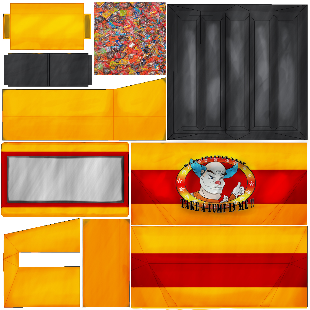
This is the only map I’ve used on this piece. I’ve abandoned my thoughts of previously adding on a normal map and keeping it more cartoon styled. This came out very nicely in the end.

Assignment 4: Opacityman.

For this assignment, our goal was to create the perfect manmap with the use of an opacity over to it. This helps it to become invisible, like Reptile.

Leaves

So here’s the file that I used. Found an easy set of leaves on the interwebs.

%AO

Here’s the Opacity Map for the leaves. Simple enough. White = Show and Black = Hide.

Render

And as proof, here is the render of the scene. Made a little house and put leaves on the front. Too bad I can’t model rakes, or this mess would be cleaned in an instance.

Another Render: Render2

Case Study #4: Scratch from Textures

Game225_CaseStudy4_Metal

For this case study, I took my metal texture and added a bit of a rusted touch on it. I wanted a light rust, nothing really degraded and still apears to be in shape. Speaking of the shape, I left the metal a bit banged up. Good for damaged armour and metal acessories of the like. Non-tilable. Needs to be offset properly to tile this. Added a blue-green cover over the metal as well as a highlight for more shine.

Game225_CaseStudy4_Wood

For my wood, I decided to make it appear “Cheap”, much like a wood cover on a desk, but still wood none the less. Low contrast and burn in grooves to help the fibers of the wood stick out better. Coated with a light gradient to help colorize the wood.

Case Study #3: Something something, blizzard.

Question#1:  What was the most impressive or suprising thing you saw in their design process and why?

I really liked their art process when it came to the animation. The usage of gray tones to make a simple storyboard for it came out very well.

Question#2:  As an artist, what would be something that you can take from this video and add it to your design process and why ?

I would take their method of story work and art process in coloring and drawing.

Question#3:  What was something that you didn’t understand or don’t think would help you in your ways as an artist and why?  Make an example.

More or less, the modeling aspect as well as the lighting. I’d rather touch upon art half of this then touching the model.

Case Study #2: Referring to your References.

Question#1: What about their style is exciting or inspirational to you?

The style of the texture looks so surreal and smooth. Makes it look more natural in general.

Question#2: What did you take away from this person that you can use to help yourself?  Was it a texturing technique, a piece of advice, or something from their art style?

I would love to learn more about how the get the texture to look more like a skin.

———————————————————————————————————————–

Artist’s Name: Delphine Doreau

Their blog URL:

http://www.del4yo.com/filettes/resume.pdf
http://www.del4yo.com/

Company(ies) worked for: Electronic Arts

Games Worked on: The Godfather (2005), LOTR 4, MySims1 + 2

Role for said Games: Texture and Concept Art

Images of some of their texture work

03 the-godfather-new-game

Case Study #1 : Insert Unwrapping Pun Here.

Program of Choice for this: Cinema 4D. Used in movies such as Beowulf, Surf’s Up, and Spiderman 3.

Link: http://www.youtube.com/watch?v=KkVStGmKKOo

Question#1:  What was their method of unwrapping?  What steps were taken and why?

The method demonstrated here was to get everything “flat” before continuing. The object being used in this tutorial was a Fuel Tank, so the texture had to seem rounded. He separated the sides by polys, then split them apart into multiple “Shells”. Afterwards, he lowered distortion of the texture by using different relax tools.

Question#2:  From what you saw in their tutorial, was there anything from their technique that you found interesting or unusual?  Why?

Frankly speaking, this looked just like a 3Ds Max copy based solely for movies. Most of the same techniques I’ve previously learned from 3ds max applied to this very easily. I do like the method of selection the instructor took on this piece though. He decided to break them evenly from side to side, so they can be evenly distributed on both ends.

Question#3:  Knowing what you know now, and seeing others working on the same material you are, what are your expectations or feelings on the matters of unwrapping?

I say my chances are better at unwrapping now then they have been in a long time. All comes with just more practice.

Design Brief #1: Carnival Boardwalk Dumpster

ClownTopPaletteCan


The theme that I’m going for is a dumpster found on boardwalk carnival. Since a carnvial is a place to have fun, the dumpster should look just as enjoyable as the rest of the place. I’m going to add stripes and stars, like an old patriotic flag. The color palette will be a mixture of red, white, orange, and gold. The middle of the can will sport a clowns’ face and smile boasting with cheer to everyone that passes by it.