In my final process I started off with references of grunge textures and dumpsters. Once I found out what type of texture I wanted I started to think of how I wanted to look in terms of the scratching and worn effects. The normal map was done with the NDO2 program and I used a tablet for the scratches and etchings inside and outside the dumpster. I used a mixture of texture from the net and a combination of a hand painted feel to make the dumpster looked very abused. Overall I am happy on how it turned out and I acheived the look that I wanted to accomplished.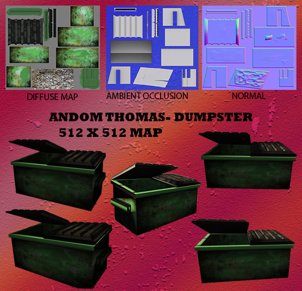
Author Archives: dogma2890
Assignment 4: Opacity
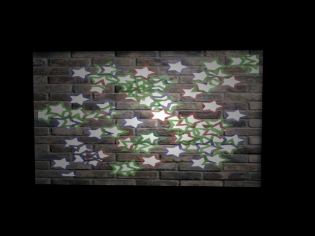
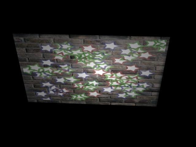
In my post I have included 4 pictures of my rendered products from my opacity maps. In my design process The first thing I did was to decide what elements I wanted on a brick wall that I will display. Once I applied an UVW map on a box I created a simulated brick wall. For my opacity map I made a plane in 3ds max and set it as close to the brick wall as possible without intersecting it. I dediced to make some stars that was multicolored to put on the background. Inside photoshop I created one layer that was called my color map with the colored stars and then I recreated another layer with the black and white version by changing the settings in photoshop and making the background black so it doesn’t show in the render in 3ds max. Below is my examples of make and opacity map on a brick wall.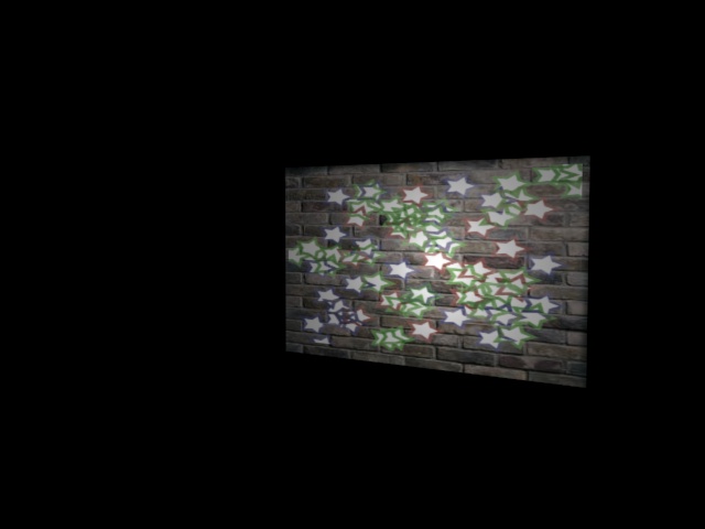

Assignment 3 Hand Painted
I added some updated pictures of my renders!
On my shield I used filters and difference clouds along with lighting effects in order to create the shadows that I wanted for the assignment. I also used some hand painted elements for the spikes and small strokes for the spikes of blood as well as the shield. I was going for
a polished shield that was barely used in battle. I wish I had a tablet and then I could add alot more detail to give it a personal touch.

Case Study #4 Textures for the first time!
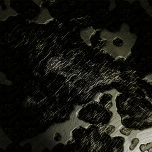
In my attempts at the texture I was going for a more realistic look because that is what I am interested in. For my metal texture I am happy the way it came out because I wanted it to look pitted but clean at the same time. It is something that you would see in an new lab but something unknown eating away at it. I used some texture and cross hatching effects on it as well as more lighting effects and shadows.
The wood texture came out ok in my opinion as I was looking for a grainy look but I also wanted to put more color into the image. I played around with darkening the strokes and using brightness and contrast. The wood seems pretty vintage but not to worn almost like a tree bark.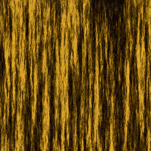
Case study #3 If its good for blizzard its good for me.
What was the most impressive or surprising thing you saw in the design process and why? I have actually seen this movie clip in modeling 2 and we were required to write what we have learned from this. I would say the most impressive thing to me is how much reference that is put into making the animations and textures for the characters. I believe that it reinforced how important it is to observe real life examples of what you are trying to model. When you try to model from memory or texture you often fall short because we often forget things that we have seen.
As an artist, what is something that you can take from this video and add it to your design process and why? When I watch this video the one thing that I take from this is the importance of planning by the use of sketches and story boarding. I remember in my modeling 1 class I had no idea how to texture and I did not get as many references as I should have to make the materials look realistic. I know now how important it is to have an idea of what your style is going to be and what you want to capture in your textures. I would like to learn z brushing because it seems to aid in the process of getting much realistic textures.
What was something you didn’t understand or don’t think would help you in your ways as an artist and why? Make an example. I really can’t say that anything in the design process of the cinematic trailer would not benefit me because it all should be explored with. If you have a closed mind and not grow on the design process you will be limited as an artist in my opinion.
Case Study#2: Do you have any references?
Description: One important factor when becoming a texture artist is the element of reference. Being able to have references for everything you do. Whether it is reference for the mood, style, model or texture. When dealing with style, you need more than just an idea or images. What about others who have traveled the same path you did? What did they do to meet their goals?
For this case study, I want you to find a texture artist; one whose style you enjoy and could use as reference. So you need to find one person, find their portfolio site or blog and answer the following. Remember to add images, and to post on at least two other students posts.
Question#1: What about their style is exciting or inspirational to you? The low polygonal work is what interests me as well as the realistic work of art. His work makes me want to try an create the same type of effects with the sci-fi element involved. I am new to texturing and I will need to look at more tutorials in order to become a better artist.
Question#2: What did you take away from this person that you can use to help yourself? Was it a texturing technique, a piece of advice, or something from their art style? As I see from the blogs that he has posted you have to practice everyday in order to learn different techniques as well as communicate with other individuals in your field to judge your work. It seems a little overwhelming wondering how am I going to make something look that great but with practice I believe anything can be accomplished.
What you need to post———————————————————————————————————————–
Artist’s Name: Tor Frick
Company(ies) worked for:
Massive Entertainment, March 2007 – July 2010
Epic Games/People Can Fly, July 2010 – October 2011
Machinegames, October 2011 – Current
Games Worked on:
World in Conflict (PC)
– Character-, environment- and texture artist.
World in Conflict: Soviet Assault (PC)
– Environment artist and texture artist.
Far Cry 3 (PC, XBOX360, PS3)
– Character-, environment- and texture artist.
Bulletstorm (PC, XBOX360, PS3)
– Environment generalist.
Gears of War 3 (XBOX360)
– Props, textures, shaders and optimization for DLC
Role for said Games:
Images of some of their texture work
Question 1 answered
Question 2 answered
Case Study 1: Your face is a UV
URL:http://www.youtube.com/watch?v=iyOhRuwRoVI
Question#1: What was their method of unwrapping? What steps were taken and why? The method that was used in the video was from the Maya software. The demonstrator used the cut tool to cut around a section in order to separate the hand. The reason why it was done this way is because he was unwrapping a hand and wanted to separate the fingers from the palm in order to apply texture.
Question#2: From what you saw in their tutorial, was there anything from their technique that you found interesting or unusual? Why? In the tutorial it seemed so much easier to unwrap the image by selecting the edges in order to cut away the desired section. The automatic mapping feature that was used at the beginning was not useful because of too many complex shapes to texture.
Question#3: Knowing what you know now, and seeing others working on the same material you are, what are your expectations or feelings on the matters of unwrapping? I can say that just seeing that technique makes me feel a little better about finding different ways of unwrapping maps in order to texture.
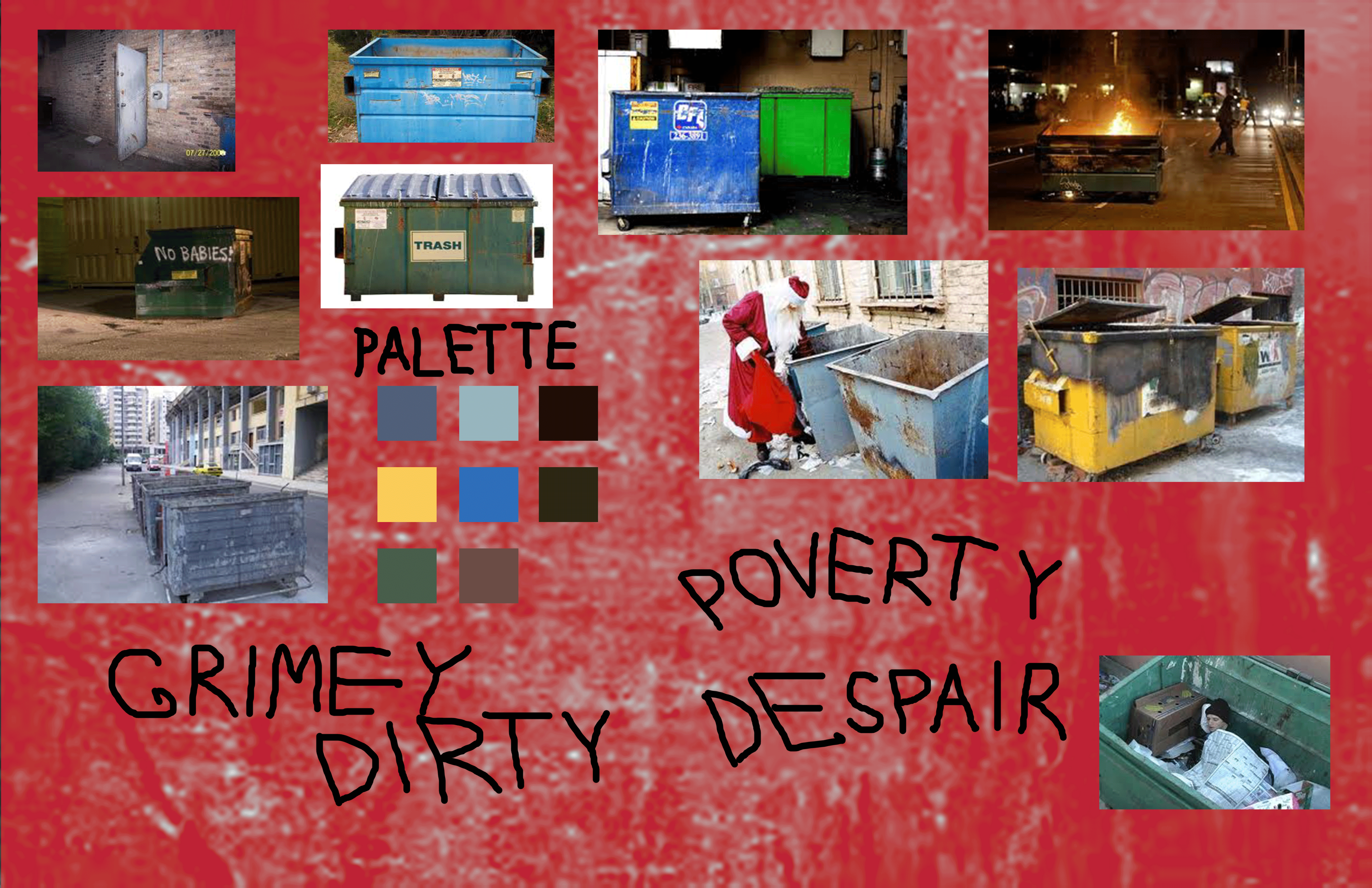
Design Brief 1: Dumpster
My development board is about a city in despair and trouble. I base it off of the city of Detroit because the influence around me at a young time in my life was hard to look at everyday. I have included scenes of people searching for food in the worst setting to show what type of look an feel that I want to portray in my developing textures in the future. The images are just of alleyways and areas that would deter the average person because of the damaged and warn down surroundings. The mood words are written sloppy on purpose to show the carelessness of the conditions in the street.
What I want to Learn
I would like to learn how to texture 3d models realistic enough to fool the human eye. I would also would like to learn quicker methods to use to texture materials.
