Design Brief pt.5: Normal Mapping

Game225_DesignBrief_Danaj_B_%Normal

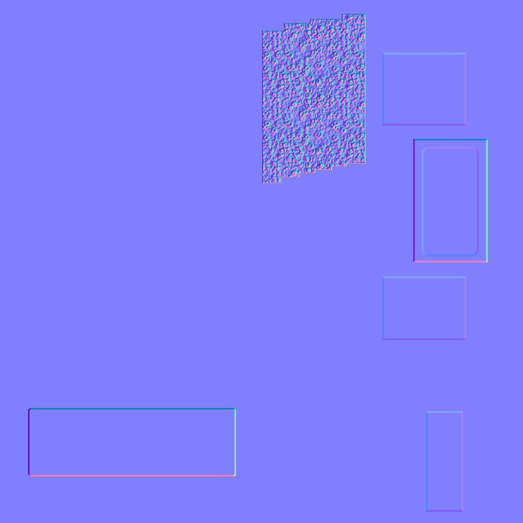
I wanted my dumpster to have a plated look to it, so I utilized a lot of simple elevated squares. The front of the dumpster has a giant touch pad on it. I created a rectangle, then used the rounded rectangle tool. I selected that portion using Ctrl + Left Click and created a new bump map for that. I then deleted the rectangle layer. To create the gold coin pattern, I found a texture online and created a repeating pattern for it, then converted that. I also lined up the original texture with the bump map, so when I add the completed, colored texture, it will line up with the bump.

Assignment 4: Opacity Maps

The creation of my opacity map was fairly simple. I modeled out the plane and used the move tool to warp some of the edges to create something of a wave effect in the vines. Designing the vines involved downloading a leaf brush pack and laying down random leaves in Photoshop. Afterward, I used the ruler tool and a thin paintbrush to connect the leaves with vines. The ruler tool ensured that the vines would line up top to bottom, so they could be tiled.

Render01

Render02

Assignment 3 Shield

Render2

Render1

My shield process began with a flat layer where I put all the base colors down, the grey metal, the brown wood, and the purpleish hue on the edge of the metal. Everything else branched off from that. I utilized a lot of transparencies and turned the opacity way down when adding more colors. The cracks and the symbols all came from Photoshop brushes. I wanted to go for a very plain-looking shield, more practical than ornamental. The multicolored gems, in my mind, are designed to give the shield (and therefore the player) a variety of enchantments. This is why they are all different colors, they are meant to be swapped out and customized. The metallic portion and wooden portion are basic textures following the instructions we learned in class.

Metal
I wanted my metal to have a dark, almost burnt look to it. I’ve always liked the idea of something that was once pristine and orderly, now dulled by age and wear. I darkened the colors and increased the contrast to make the blackened sections pop out more.

Wood

I wanted a rotted wood look for mine, so I added a very faint green tint to my texture. Not enough that it’s directly noticeable, but it does make the wood look a bit more worn out.

Case Study 3: If it’s good for Blizzard, it’s good for me.

1. What I found really intriguing was their mention of creating details that add to the scene without drawing attention to them. A chief example is the collapsing brick wall they programmed, and how each brick had to be modeled and animated. Most viewers wouldn’t notice a detail like that, but without it, the scene would be missing something.

2. The amount of references and research they performed before even animating is definitely something I can take away from this. I need to get it in my head that the majority of my work will consist of finding references, not actually modeling.

3. I’m not sure how much the animating process will help my modeling work. I don’t know if, as a modeler, I will be involved in animating the figures for the game. I know it will be partly my job to make sure the model has enough detail that adequate animation is possible, but I don’t know if I will be doing actual animating.

Case Study#2: Do you have any references?

Artist’s Name: Emmy Wahlback
Their blog URL: http://enmi.weebly.com/3d-art.html
Company(ies) worked for: Stunlock Studios
Games Worked on: Bloodline Champions
Role for said Games: Texture artist

Question 1: In a day and age where photorealism is becoming the new norm, I have always more appreciated cel shading and cartoony designs. While I think textures and models becoming more and more detailed is a great technological advancement, cel-shading has always been more visually appealing to me, as well as allowing for more freedom in design.

Question 2: I really like the way she textures fur patterns on her characters. Making fur look good can be difficult, especially with textures. She uses a lot of blurred, blended lines overlaying a gradient to create a fantastic look.

Case Study #1: Your Face is a UV

Unwrapping UVs in Maya: Texturing a church pew

1. Their method of unwrapping involved using a checkerboard pattern to check UV levels. He unwrapped specific sides of the pew individually and then connected the sides in the UV editor as they would be connected in the actual object. He used planar mapping to ensure that the texture would not be skewed when it was placed on the object.

2. I only have modeling experience in 3DS Max and not a lot of texture experience, so anything I see will be new information for me. Nothing about these steps seemed unusual, but I was glad to see simple tricks to make sure the textures line up with each other.

3. I know unwrapping is the bread and butter of texturing. Very few objects in games nowadays are simple enough that one can just slap a texture on without unwrapping first. I hope to absorb every bit of knowledge on unwrapping I can in this class.

Design Brief 1: Dumpster

DesignSheet

I wanted to go for a cel-shaded design in a post-apocalyptic environment. The dumpsters are ravaged by the apocalypse but they are maintained due to how important they are to the people in the world. They are used as secure storage units and highly revered due to their sturdiness. Therefore people take care of the dumpsters/safes they’ve secured.

Expectations

By the time this class is over, I hope to learn a great deal about the importance of texturing in modeling. 3D modeling is my goal in the video game industry, so I need to pay very close attention to this class. I know very little about texturing and lighting as it stands right now, so this class will be very crucial in my growth.