Assignment#4 Opacity map David Schlotterbeck

Davids Vines

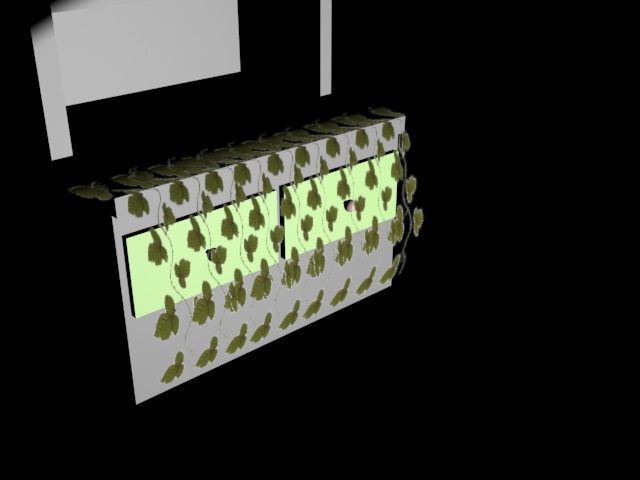
This assignment seemed simple enough. the only challenge was making the vines themselves becuase the ground work was easy.

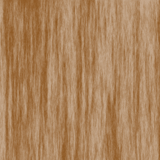
I figured the vines would be so small you would have to be rob to notice irregularities so I went ahead and took a picture of a leaf and resized it over and over again to mathc my neededs. Taking the color of the leaves i created a stem of which was a basic line for all the leaves to connect to.

In the end if i took my final render and made them all smaller just to copy and paste them again it would look more realistic then what it is at now.

Assignment #3 Hand-Painted David Schlotterbeck

Render 1 Render 2

I like how my shield turned out. i wish i diden’t paint those lines running through the shield. i accidentaly painted on a layer i needed to stay in so i left it.

I used necro symbols and my extras are necro energy on the side with cracks across the shield.

My renders came out a little dark but I like that aspect of it. It covers up little mistakes.

Case Study#4 Steel and Wood David Schlotterbeck

Steel Wood


With the steel I messed up near the end of making the original. To make the steel that you see here i used a repetition of the Chrome Effect mixed with Angled Strokes. I kept the overall color because with the revisions i made the shine it had to it had been disposed of.

The wood is pretty much a remake of the original with a different color. one main difference is that i tuned up the strength of the Fiber tool. I also created a duplicate of my change and flipped it upside down. i lowered its opacity and started to blend them together.

Case Study #3 if its good for Blizzard David Schlotterbeck

Question#1:  What was the most impressive or surprising thing you saw in their design process and why?

I’m still suprised at the sheer level of skill that these people have. When I saw the 3D design for Azmodan I was taken aback by the detail put on him through Mudbox and Z-Brush. those two programs I have not even touched yet and they put out something that nice. This video just goes to show me that I have a long way to go.

Question#2:  As an artist, what would be something that you can take from this video and add it to your design process and why ?

Always keep in mind the value of storyboards. remember that they are not all supposed to be kept. Don’t grow attached to them, they will be thrown away. Always make sure they have a decent amount of detail in them for others to work off of just in-case your idea is used.

Question#3:  What was something that you didn’t understand or don’t think would help you in your ways as an artist and why?  Make an example.

How do you simply “add the lighting together?” they made all of the different lighting types separately but they can all combine? I don’t understand how that was done. I wonder if it is as simple as importing them in the same seen or if there is some modifications needed to be made

Case Study#2: Do you have any references? (David Schlotterbeck)


Artist’s Name: caponeart (could not find full name)

Their blog URL:  http://www.caponeart.com/

Company(ies) worked for:  Epic games, Triumph Studios, Volition, Inc., Microsoft, Halcyon Games, and Grin

Games Worked on:Kinectimals, Unreal3, Gears of War, Overlord, Saints Row, and Terminator Salvation.

Role for said Games: Texture Artist

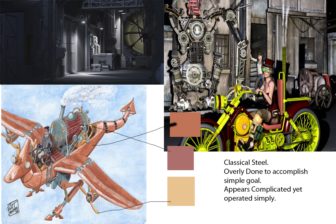
Question 1: What I like about his style is the more light-hearted his work is, the brighter his colors get. They mask some mistakes he may have made while giving his work the appearance of fine detail. His “darker” works are a little bland, but the texturing is on point. The textures themselves are a little off, but their placements are well done.

Question 2: I find that if I give my work a little shine, it can look good while giving everything a more light-hearted feeling. For the time being, at least until my abilities in texturing improve, I think that aspect of his work will add onto mine. Just a little something to help define my style.

Case Study#1 Unwrapping (David Schlotterbeck)


Question#1: What was their method of unwrapping? What steps were taken and why? They explained some basics like flattening face selection and map unfolding. These steps were done to show some basic commands since the video was an introduction.

Question#2: From what you saw in their tutorial, was there anything from their technique that you found interesting or unusual? Why? I found map unfolding unusual. I see it taking pieces from the flattening phase and putting them back together into bigger pieces. I remember some texture laying from modeling 1 and how it was used in unwrapping but i don’t see how it can be imitated here.

Question#3: Knowing what you know now, and seeing others working on the same material you are, what are your expectations or feelings on the matters of unwrapping? I am ready to get started on unwrapping because i see it as an easy way to places textures on an object without repeating patterns.